Website Navigation Trends: 16 UI Patterns Totally Deconstructed
Website Navigation Trends: 16 UI Patterns Totally Deconstructed
- Searches
- Notifications
- Jump to Section
- “Sticky” Fixed Navigation
- Vertical Navigation
- Slideouts (Drawers)
- Popovers
- Modals
- Calls to Action
- Featured Content
- Recommendations
- Related Content
- History / Recently Viewed
- Next Steps
- Walkthroughs & Coach Marks
- Links to Everything
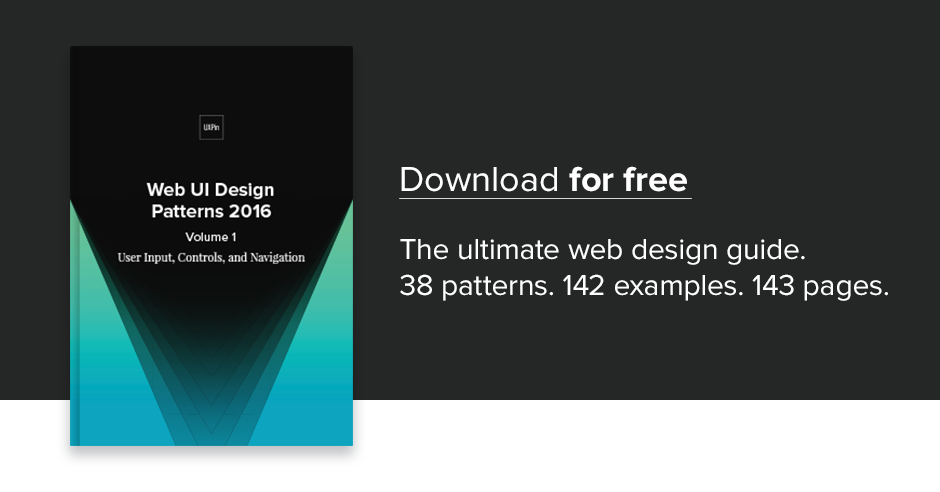
We’ll explore plenty of examples, best practices, and appropriate scenarios. When you’re done, feel free to check out the free e-book Web UI Patterns 2016 Vol. 1 for more tips an examples.
Let’s begin!
1. Searches


Problem
User is looking for something specific and doesn’t know where it is or wants a direct route there.
Solution
One of the most basic and popular patterns, including a search option is a navigation necessity. Typically a search bar in the upper-right corner, this feature finds related content within the site, saving the user time in going where they want.
Tips
- If you’re tight on space, use an expandable input bar coupled with a magnifying glass icon. The New York Times even has a dropdown search bar when the user clicks the icon at the top.
- The more content you have, the more prominently you want to display your search feature. For example, content-heavy Facebook and YouTube break from the upper-right corner norm and have their searches in the upper-left and upper-center.
- The autocomplete pattern further saves the user time and may even suggest content or proper wording.
- If the user can search for multiple criteria, use the input hint pattern to explain (i.e., Facebook).
2. Notifications


Problem
The user doesn’t know when others are interacting with them, or when new content is available.
Solution
Notifications have been popularized by social media sites as a way for users to know when others are interacting with them. However, it’s since spread to sites and web apps, with notifications available for new content, products, comments, or sales. The user, of course, selects which items they’d like notifications for.
Google actually integrates notifications across multiple products. This means that when a user logs into Gmail, they can receive quickly check to see if anyone responded to their comment on YouTube.
Tips
- The most generally accepted icon for notifications is a bell.
- Notifications are almost always marked by a colored and circled number next to the appropriate icon. Choose a color that will stand out, as the point of notifications is to attract attention to new material.
- Occasional product updates are fine, but don’t abuse notifications with too much self-promotional news. This weakens the impact for worthwhile news.
- If a user has not logged in for quite some time (e.g., one week or more), consider adding a quick notifications summary modal to highlight important events.
3. Jump to Section


Problem
Browsing or returning to certain sections on a page involves too much scrolling.
Solution
A jump-to option, whether a text link or icon, saves the user time. As an optional feature, this should not draw too much attention from the main text, but it certain helps provide anchoring points for long-scrolling sites.
For long text-based content, adding links to the table of contents is a quick solution. This is a simple and practical solution that’s been around for a while with Wikipedia as the most known example.
But with the increasing popularity of infinite-scrolling sites, particularly with user-generated content, the option for jumping to the top of the page has become a pattern. This lets users return to familiar ground in case they get lost, or want to visit another page.
Tips
- A return-to-top button usually goes unused since people can just scroll quickly, but it may be helpful for infinite-scrolling sites. For this reason, the option should be small and unobtrusive, like Tumblr’s and eBay’s tabs, “stuck” to the side scrollbar.
- Unnecessary if you use an effective sticky navigation bar (described below).

Do you want to know more about UI Design?
Download ‘Free Ebook: Web Design Trends 2016’ FOR FREE!
4. Sticky (Fixed) Navigation


Problem
Users get disoriented and lost when long-scrolling, or returning to the main navigation menu requires too much backtracking.
Solution
Implement a fixed navigation menu that stays in place when the page is scrolled, nicknamed “sticky” navigation. While the top navigation menu is most common, sides and bottom are also common (but more obtrusive).
As a site with an infinite-scrolling feed, Facebook uses a sticky top navigation menu well. It gives users the always-present option to “change course,” if they suddenly want to search something specific, check their profile, or see their notifications.
Craigslist even uses sticky navigation on three sides, and two on the top. The bottom and first top menus are universal to the site, allowing users to go anywhere. The left menu and second top menus are specific to the current page, helping to refine searches, or start new searches for that field, respectively.
Tips
- Since they always occupy a portion of the screen, sticky navigation menus should be as small as possible.
- Highly recommended for single-page sites, which otherwise would lack any form of navigation menu.
- For the sake of mobile experience, shrink the sticky navigation for smartphone users. This microinteraction draws attention to the menu so the user knows it’s there if they get lost. If your menu is already quite compact, you can try changing the colors upon scroll (Mint) to draw attention through contrast.
- If your site features a mosaic of images in a card format, a sticky navigation is not advised since it can get lost in the noise when users scroll downwards. To learn more, check out this article on the pros and cons.
5. Vertical Navigation


Problem
There are too many important links that don’t fit across a horizontal navigation menu.
Solution
For more room, use a vertical navigation menu on the side. This allows you to list important sections in the most space-efficient way — as long as those links are necessary.
Vertical navigation can be used by sites with many pages that want to give their users all the options. This format also keeps the top and bottom of the screen free for either content, or more general navigation options.
Just like jump to navigation, this pattern emerged to suit the needs of long-scrolling sites. It’s well-suited for sites with user-generated content, and can be combined with other patterns like slideouts and sticky navigation.
Sites like Facebook, YouTube, and Wikipedia all take advantage of vertical navigation. While each of these sites has an excess of content, the reason they chose this pattern is an excess of pages. The benefit of vertical navigation is allow users to move freely between pages — not individual pieces of content.
Tips
- Because vertical navigation lists take up a lot of space, consider hiding them as slideouts (described below).
- Don’t limit yourself to the left side — a right-side vertical navigation menu can make your site stand out. The left side is better for visibility with the F-pattern (see Chapter 5) and main navigation, but if your list is simple, it doesn’t matter where it goes.
- To get creative you can also try combining the vertical navigation and jump-to pattern to create a minimalist navigation like what you see on Born Fighters.
6. Slideouts (Drawers)


Problem
The navigation menu takes up too much space.
Solution
Hiding the navigation menu as a pull-out menu or slideout gives your users the options they want, without wasting space — having your cake and eating it, too.
This pattern is best known on mobile devices where space is scarce, popularized mostly through the hamburger icon. The current iteration of this pattern takes many forms: the grid icon (Wired) or a simple “Menu” button that acts like a hamburger menu (DeviantArt).
Slideouts are very flexible in what they can contain. Small slideouts will contain textual links, while bigger slideouts showcase rich icons and even photos (e.g., a profile photo for a social app).
Moreover, slideouts are often used for standalone functions, such as chat windows. Facebook, Gmail, and other sites keep these windows tucked away when they’re not in use.
Tips
- Use recognizable icons, such as the grid, so your user knows on sight how they work. For the most clarity, you can even use a “MENU” label.
- Pay attention to the animation as the menu pulls out. This is key to maintaining the illusion that the menu is actually tucked away. If you make the drawer slide out too quickly, all the information at once will overwhelm the user. Give the animation roughly 200 – 300ms to play out the sliding motion, moving towards the upper end of the spectrum as your items increase.
- Create contrast between the slideout menu items and the menu background.
7. Popovers


Problem
The user wants more information without losing their place on the current page.
Solution
Usually activated by hovering, popovers add the details that would take up too much room to display permanently. They are similar to hover controls, but with information.
The appeal of popovers is that they don’t disrupt the user’s task flow as much as going to a separate page. This makes them great for browsing through a large amount of content, where the user can call up more details about only the choices that interest them.
Look at Netflix: showing details for every movie would mean less entries per page, which makes browsing more difficult. With their current UI, when something catches the user’s eye, they can learn about it without interrupting their browsing.
Tips
- Popovers work perfectly with the card layout: designers can display a large amount of content option in manageable doses, and conserve space in each card by listing some information in popovers.
- A small pointer keeps track of which entry the popover relates to, especially useful for close textual links like Rotten Tomatoes.
8. Modals


Problem
User is not noticing or interacting with important content.
Solution
Because they require interacting, modals are a surefire way to communicate important information. Like popovers, modals provide additional information without the user leaving the page. The key difference, though, is that modals demand a click, even if it’s to click “Skip” or “OK.”
Modals typically have two uses:
- Draw the user’s attention to a feature they might be unaware of
- Promotion
For example, if you visit the site for Gap outside of the U.S., a modal notifies you about international shipping in your area, and provides links to its international sister sites. Similarly, Fitocracy uses modals to point out and explain how certain features work.
The other popular use for modals is site promotion. Often, sites use call-to-action modals to increase conversions on signups, sales, newsletter subscriptions, etc.
Tips
- Differentiate the background when the modal pops up to draw attention. This usually means fading the landing page, but a creative filter can also work as long as it’s not distracting.
- Allow users to close the modal either by clicking outside the box or tapping the ESC key
- If forcing users to click is a concern, have your modal automatically minimize itself and become a call-to-action button on the landing page. Use animation to make the correlation clear.
- A multi-page modal works great for onboarding tutorials, as users can still see the normal screens behind them.
- Modals can also show when users leave a site, as one last chance to regain their attention.
- For email subscription modals, trigger them once a user scrolls partway through the content so you don’t annoy them.
9. Calls to Action


Problem
Users need a clear next step on the page.
Solution
Influence users with calls to action in the form of obvious buttons inviting them towards an action, whether buying, signing up, or simply visiting certain content.
The most important factor for CTAs is visibility — they should be noticed, without being too flashy. In fact, CTAs should be the among the first elements the user sees; after all, they are synonymous with business goals and therefore integral to the site.
The CTAs on Squarespace are clear and noticeable. Their black-and-white color scheme attracts attention, the succinct and direct wording leaves no room for misinterpretation, and their fixed position keeps them on the screen permanently to add constant urging.
Tips
- Colors are an effective way to get your CTA noticed. Attention-grabbing colors such as orange and green are good, as is using a color that contrasts with the background, such as white against black. For a more thorough analysis of colors in web design, check out Web UI Design for the Human Eye: Volume 1.
- Another method for visibility is location. Situate CTAs in the most seen areas on the screen. While these change depending on your layout (see Chapter 5), the top is usually a safe spot. The only sure solution, however, is to A/B test the position.
- As we see with Squarespace, making CTAs sticky gives them extra emphasis, plus ensures they’re permanently on the screen.
- Consider ghost buttons as a flat-inspired alternative to the traditional CTA button. Ghost buttons fill with color as users hover over, adding an element of visual delight.
10. Featured Content


Problem
Users aren’t immediately able to discern the most important content on the page.
Solution
Let users browse the top content. Usually, this means featuring the most interesting content front-and-center (especially useful for sites driven by user-generated content).
Developed for print media and journalism, this pattern takes on new meaning on sites with user-generated content. With no “newsworthy” or “most recent” criteria to fill, site managers are free to pick any content to fill this area, and thus can sway the user’s impression of the site, while at the same time promoting chosen content.
Featured content is as versatile as the site’s business goals. The content could be paid, popular, new, or demonstrating creative ways to use the site.
A site committed to its users, Etsy uses featured content as the main focus of their home page. Behance, on the other hand, treats theirs as a separate tab.
Tips
- Do your homework before deciding if a carousel is appropriate to feature content. As a general rule, it’s best to avoid them unless compelling user behavior indicates otherwise.
- To immediately capture the user’s attention, try experimenting with a hero image above the fold.
11. Recommendations


Problem
The user wants content personalized to their preferences.
Solution
Just like featured content, recommendations lead users to content they’ll (probably) like. The difference is recommendations are tailored specifically to individual’s tastes.
Recommendations are most known for ecommerce pages, where recommendations are based on previous purchases. But they’re available to any site able to collect enough user data, whether through profile data frequent usage.
Social media sites like Facebook analyze friend/follower lists to calculate people you’re likely know. More friends means more site interaction. Sites like Hulu and YouTube simply categorize the types of videos you watch and recommend similar ones.
Amazon goes above and beyond, offering different variations of recommendations from different metrics like previously viewed, browsing history, and items in your wishlist.
Tips
- Personalization is the key: the better your know the user, the more accurate the recommendations. Use all available data about your user.
- When users create a profile, ask them to select a certain number of tags to fine-tune their preferences.
12. Related Content


Problem
The user wants to browse similar content without a new search.
Solution
While it goes by many names, the pattern of showcasing related content is popular for ecommerce, blog, and article sites. It’s effective for the same reasons as recommendations, but without needing user data.
Related content generally works through tagging (see Chapter 1), or at the very least keywords. There is room for variation, though: in the above example, BBC promotes stories of different topics, but aligned with the user’s interest in the hidden dangers of common substances.
Another helpful guide is tracking similar viewers, as with eBay and IMDb. Judging by viewing patterns, users looking at the same content might have the same goals, in which case you can use past usage to predict helpful pages.
Tips
- The accuracy of related content usually depends on the tagging system: more elaborate tags create more specific results.
- Almost an expectation for ecommerce and news/blog sites.
13. Recently Viewed (History)


Problem
The user wants to see content they previously viewed without backtracking.
Solution
Showing recently viewed content helps users switch back and forth between pages, especially useful for comparison shopping. This pattern also creates a UI forgiving to user, in case they are indecisive or wish to return to prior content (but forgot the details).
For ecommerce sites, this simply facilitates the shopping process. Users likely have multiple products in mind, and the freedom to switch between those pages helps them achieve their goals.
This pattern is especially useful for sites like Pandora, in which users can interact with songs they previous listened to, liking or disliking them to customize their preferences.
In addition to a bar at the bottom, IMDb gives the option to see an entire page of user’s history, with a description on hover that says when the user viewed this item.
Tips
- Give users the option to edit and delete items from their history to avoid mistakes from affecting the personalization features (like inaccurate recommendations).
- How far back you go depends on the type of site and its capabilities. While remembering months ago is a nice feature for IMDb, it’s not necessary for a sites like Target where users typically have a final product in mind.
14. Next Steps


Problem
The user wants recommendations for what to do next.
Solution
Directly guide the user to their next steps.
For the instances where featured, related, or recommended content fall short, it helps to be blunt about your user’s next steps. Any hesitation or confusion in the user task flow, even momentary, harms your UX. A next step prompt simply keeps things running smoothly. Imgur’s “Next Post” option streamlines the site experience, and creates an addictive habit loop for longer sessions.
Next steps are also frequently used for administrative tasks like fuller profile completion. These prompts remind the user of optional tasks. OKCupid uses a modal to help users who’ve been away get back into the swing of things, while Quora gives a reminder to update preferences for a better results.
Tips
- Promote certain steps over others with visual hierarchy techniques. Look at how Yelp’s big red button for “Write a review” outshines the other potential actions.
- When used for profile completion, couple this with the completeness meter pattern for more urgency.
Do you want to know more about UI Design?
Download ‘Free Ebook: Web Design Trends 2016’ FOR FREE!
15. Walkthroughs (User Onboarding)


Problem
New users need some tips to get started.
Solution
Walkthroughs (also known as user onboarding) explain how the UI and specific features work. Almost sites will have some kind of onboarding process to explain how everything works to beginners or updated features to old users.
Coach marks, as with the Quora example, draw attention to the features where they exist in the normal UI. This doesn’t distract the user from their regular routine, and are less intensive than full-scale walkthroughs.
Tips
- Keep walkthroughs succinct so that users can get to actually using the site.
- Pictures can communicate faster and more clearly than heavy explanations.
- This patterns helps users make the most out of the site. Many walkthroughs like the one for Pinterest require users to choose their favorite tags right from the beginning to customize that user’s experience more deeply.
- Try using walkthroughs through modals: with the UI in the background, the process seems less intrusive.
- Provide a “skip” option to avoid frustration from some users.
16. Links to Everything


Problem
The navigation system on its own is too limiting.
Solution
Give users more freedom to explore by linking most or all the site’s content. This allows them to go to new locations as they interact normally, instead of stopping their flow to figure out how to get there in the traditional navigation system.
This pattern is all about clickability — almost everything is interactive. This is popular for Wikipedia, where users can easily jump to another entry for clarification on the initial entry.
Similarly, IMDb has a large degree of interactivity: people, genres, dates, ratings, users, and media are all clickable for more details, not to mention individual entry pages like “Trivia” or “Plot summary.”
While not a database, Asana requires interconnectivity to assist users in organizing their workflows. Projects, people, and pages are all linked for a UI that’s as fast as the user’s thoughts.
Tips
- Always denote hyperlinks if they exist within non-clickable text. Blue and underlined is the safest bet.
- If the object doesn’t have it’s own page or the information is small, try a popover instead, since they are less disruptive to user flows.
Additional Tips
If you found this post useful, check out the full length e-book Web UI Patterns 2016 Volume 1.
The guide explains 140+ examples for 38 useful UI patterns.

Jerry Cao is a content strategist at UXPin where he gets to put his overly active imagination to paper every day. In a past life, he developed content strategies for clients at Brafton and worked in traditional advertising at DDB San Francisco. In his spare time he enjoys playing electric guitar, watching foreign horror films, and expanding his knowledge of random facts. Follow him on Twitter.
Website Navigation Trends: 16 UI Patterns Totally Deconstructed.
Source: Website Navigation Trends: 16 UI Patterns Totally Deconstructed


